How 10 Became 9
Hi, everyone
I hope you are doing well. Recently, I entered one of my photographs into a print competition, and something interesting happened. Before the competition, the judges saw the digital image and gave it a perfect score of 10. When they saw the physical print, it received a 9.
Now, a 9 is obviously a very good score. I was happy with it. But several of the comments came back to the same thing: the print did not quite have the impact of the digital image they had seen beforehand. And looking at the two, I thought that was a fair criticism.
That gave me a good reason to put three versions next to each other: the digital original, a paper print I made on my Epson ET-8550, and a metal print from an outside lab. The differences say quite a bit about what happens after we finish editing on the monitor.
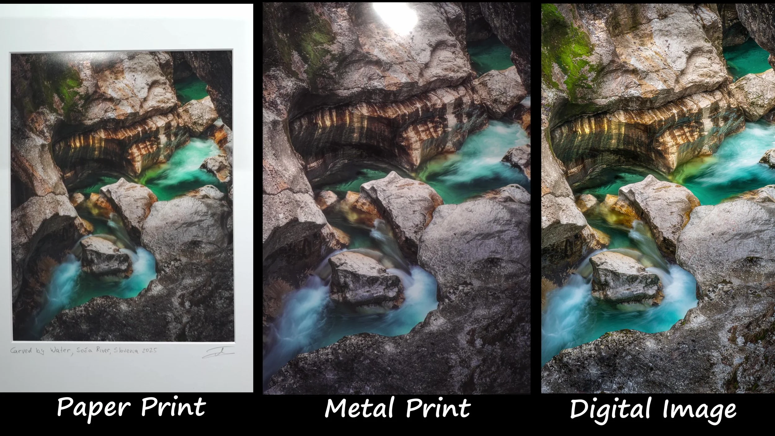
The paper print, metal print, and digital image. The same photograph has a different character in each version.
A Screen and a Print Work Differently

The warm rock, cool water, and deep shadows make this photograph a useful test for printing.
I have touched on this in previous printing posts, but it is worth coming back to. A monitor produces light. A print reflects the light falling on it. That changes how we see everything from the brightest highlights to the deepest shadows.
On the monitor, a bright area can seem to glow against a dark background. On paper, the brightest white depends on the paper and the viewing light. The darkest tones depend on the ink, paper, and printing process. The surface matters too. A glossy print, a textured art paper, and a metal print can give the same photograph very different feelings.
Good color management and ICC profiles are important, of course. But they do not remove those physical differences. I am interested in getting a print that works on its own, even if it cannot reproduce every quality of the image on my screen.
This particular image makes the differences fairly easy to see. The yellow and orange tones stand out against the cool water. There are subtle details in the dark rock, and the bright water still needs to retain texture. Quite a lot of its impact comes from that combination of contrast and luminosity.
Why I Make a Separate Print File
Once I finish editing an image for the screen, I often make another version specifically for printing. That version can look a little wrong on the monitor. Sometimes it looks very wrong. That is intentional, because I am making changes based on the physical print.
With my ET-8550, the papers I use, and my current workflow, the yellows and oranges in some images come back cooler than I want. This is my experience with this combination of printer, paper, and settings. It is not something I would assume about every ET-8550 print.
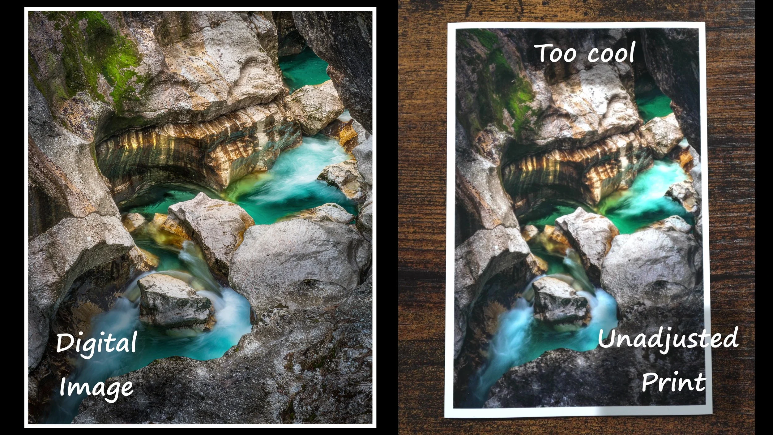
The digital image beside a print made without the additional compensation. The rocks lose some of the warmth visible on screen.
Depending on the photograph, I might adjust yellows and oranges separately, change the temperature, or use masks to target a particular area. The point is to judge the result after printing. A file that looks too warm on the monitor may give me the print I wanted. A file that looks perfect on the monitor may not.
What Happens in the Deepest Shadows
The more interesting problem in this photograph is in the dark rock. On the monitor, I can distinguish several tones that are all very close to black. When I print the image, some of those values become difficult to tell apart. The information may be in the file, but I am not seeing the same separation in the print.
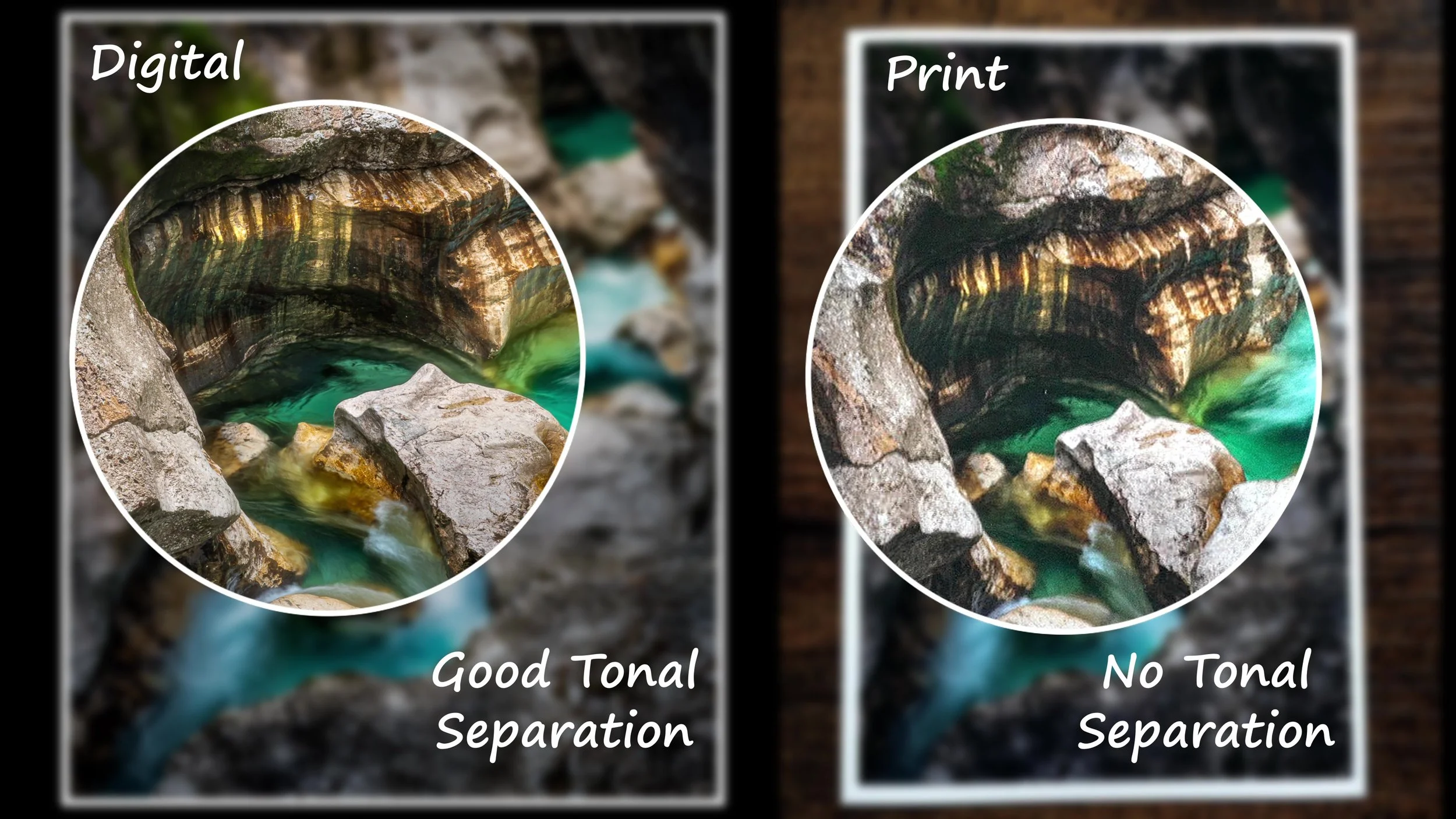
The enlarged areas show the shadow separation in the digital image and how much of it is lost in the unadjusted print.
One of the adjustments I use is a curve that lifts the darkest values. I am trying to move those tones into a range where the printer and paper can show more of the differences between them. It works: I can see more detail in the shadows.
But there is a price. Once I lift those blacks, they are no longer quite as black. The image can become more open and a little softer, with less of the depth and drama that made the digital version work. Finding the right amount takes some testing.
The Adjustment Can Go Too Far
And in this case, I did go too far with the warming adjustment. The finished paper print looks noticeably warmer than the digital image or the unadjusted print. That also reduces some of the contrast between the warm rock and the cool water.
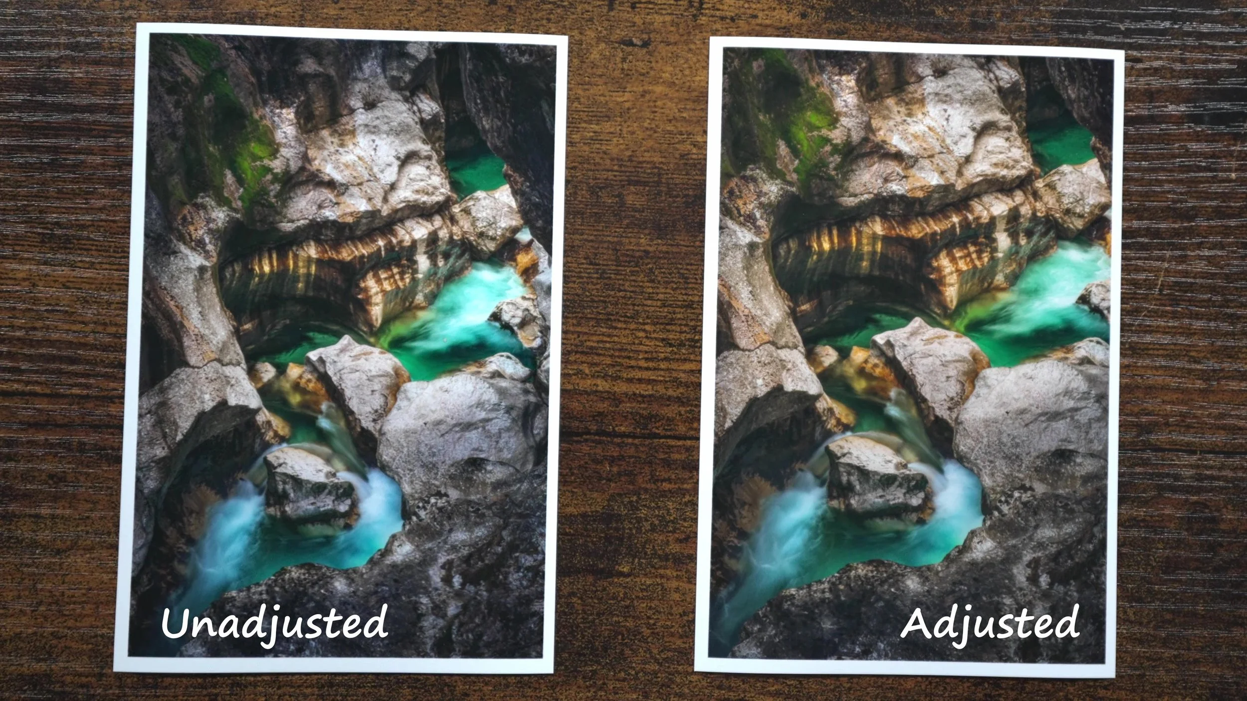
The unadjusted and adjusted paper prints. Opening the shadows reveals more detail, but the warmer, more restrained result changes the mood.
I gained some tonal information, but I also lost some of the visual punch. That is probably part of what the judges were responding to. They had already seen the deeper blacks and luminous color of the digital version. The paper print was still good, but it was giving them a different experience.
Where the Metal Print Fits
The metal print gets closer to what I see on the monitor. The warm colors retain more intensity, the blacks feel deeper, and the image has more of that luminous quality. It is still reflecting light, of course. It is the printing process and surface that give it a different character.
For this photograph, I think that works very well. But I would not take that as a reason to abandon paper. Different papers have their own textures and ways of rendering an image. Sometimes a quieter, more tactile print is exactly what I want.
I am planning to print this same photograph on several different papers, including a metallic paper, so that I can compare the results directly. I am particularly curious to see whether the metallic surface will preserve more of the qualities I like in the metal print. Stay tuned for that one!
What Losing that Point Taught Me
If I am entering a print competition, the finished object is what the judges are evaluating. The time I spent editing the digital file matters, but I still have to look carefully at what came out of the printer. It may need another adjustment, another test print, or a different paper.
The more I print, the less I think there has to be one definitive finished version of a photograph. I can have a version for the screen and a different one for a particular paper. The goal is to understand what the medium does well and make the photograph work within it.
So, losing that one point turned out to be a useful lesson, and a good subject for a video. If you would like to see the comparisons and the adjustments in more detail, check out the accompanying video. I hope you will find it useful for your own printing.
Have you had a print come back looking quite different from what you expected? Let me know what helped you get a result you were happy with.
Have a great day
Dimitry
